Overview
Role
Timeline
Solve Employment is a non-profit
and socially responsible freelancing platform that helps those in Southeast Asia find employment.
Responsibilities
Team
Worked on Talent/Applicant Mobile Design, UX Research, Product Thinking, Information Architecture, Interaction, Visual Design, Prototyping, and Testing
2 Stakeholders , 7 Product Designers, and 2 Developers
Product Designer
This project took place in 2 weeks on July 2019
IMPROVING THE MOBILE EXPERIENCE FOR JOB SEEKERS
Solve Employment aims to increase job opportunities for the next generation in Indonesia and neighboring countries. Three teams with seven UX designers each were given the opportunity to improve the user experience of the current mobile application.
My team of seven designers further split into 3 groups to focus on each user type: the admin, talent, and employer. Our subgroup focused on understanding the needs of talents and creating a seamless mobile experience for searching jobs and completing work.

PROBLEMS
DETERMINED BY THE CEO:
LOSING APPLICANTS AND ENGAGEMENT THROUGH A DATED EXPERIENCE
Stakeholder interviews were conducted with the head developer, head UX design and CEO of Solve Education (the parent organization of Solve Employment). The main complaints users had with the platform was that it was difficult to navigate, as well as understand how many jobs had been applied for or were active.
INITIAL
EXPLORATIONS
& RESEARCH
Another problem our team encountered was interviewing young adults from Indonesia. We didn’t know much about their culture or the current economic state the country was in.
After realizing that we didn’t start with the “why” or “who” we were building this for, we went into the research phase of our project.
Our team focused on teenagers and young adults 16-28. Half of the audience that utilizes solve employment are young adults trying to find work in order to provide for their family.

USER ANALYSIS:
LEARNING AND
PINPOINTING APPLICANTS
DISSATISFACTIONS WITH SE
Since we discovered a cultural barrier issue, we took it upon ourselves to post on Fiverr to interview young adults between the ages of 18-25. We interviewed a total of five participants from Indonesia to understand their behaviors and mindsets about using solve employment.
Young adults expressed interest in using Solve employment but encountered difficulties using the mobile app.
The following key findings contain core problems that our team aims to solve for the mobile app: everything looks the same and applying to a job takes effort.

ELEVATING THE CHOICE ARCHITECTURE
I understood users complaints about all of the key features seeming homogeneous to one another on the app. During a few feedback sessions, applicants stated that they wanted to access jobs in real-time. There was also a concern from applicants going into the hamburger menu in order to locate certain features as well.
The first step was to add a bottom nav, so applicants could easily access features they prioritized the most. Adding the nav bar added an extra layer and complexity to the architecture, but we quickly figured it out by diagraming and connecting existing features to one another.

CREATING AN INCLUSIVE USER FLOW FOR EXPLORATION
It took us a couple of rounds to define the user flow for the talent section. In order to figure out what features applicants wanted the most, my team did quantitative research by sending out a quick survey. The surveys helped us quickly reveal which features needed to be placed on the nav: earnings, tracker, dashboard, chat, and profile.
Working closely as a team, we went through multiple iterations and mapped out each core feature for applicants applying to jobs.

DESIGNING FOR THE NEXT GENERATION IN INDONESIA
As a team of seven, we created a design system in order to have consistency in color, typography text sizing, shadows, components (buttons, cards, navigation bar, etc.) and sizing. Using the same system was instrumental in have the talent, hirer and admin sides maintain a similar feeling.
Now if an applicant chooses to dig deeper into their status, they are presented with the option of clicking the content they wish to investigate and will be directed to their desired screen with expanded information on their desired subject.


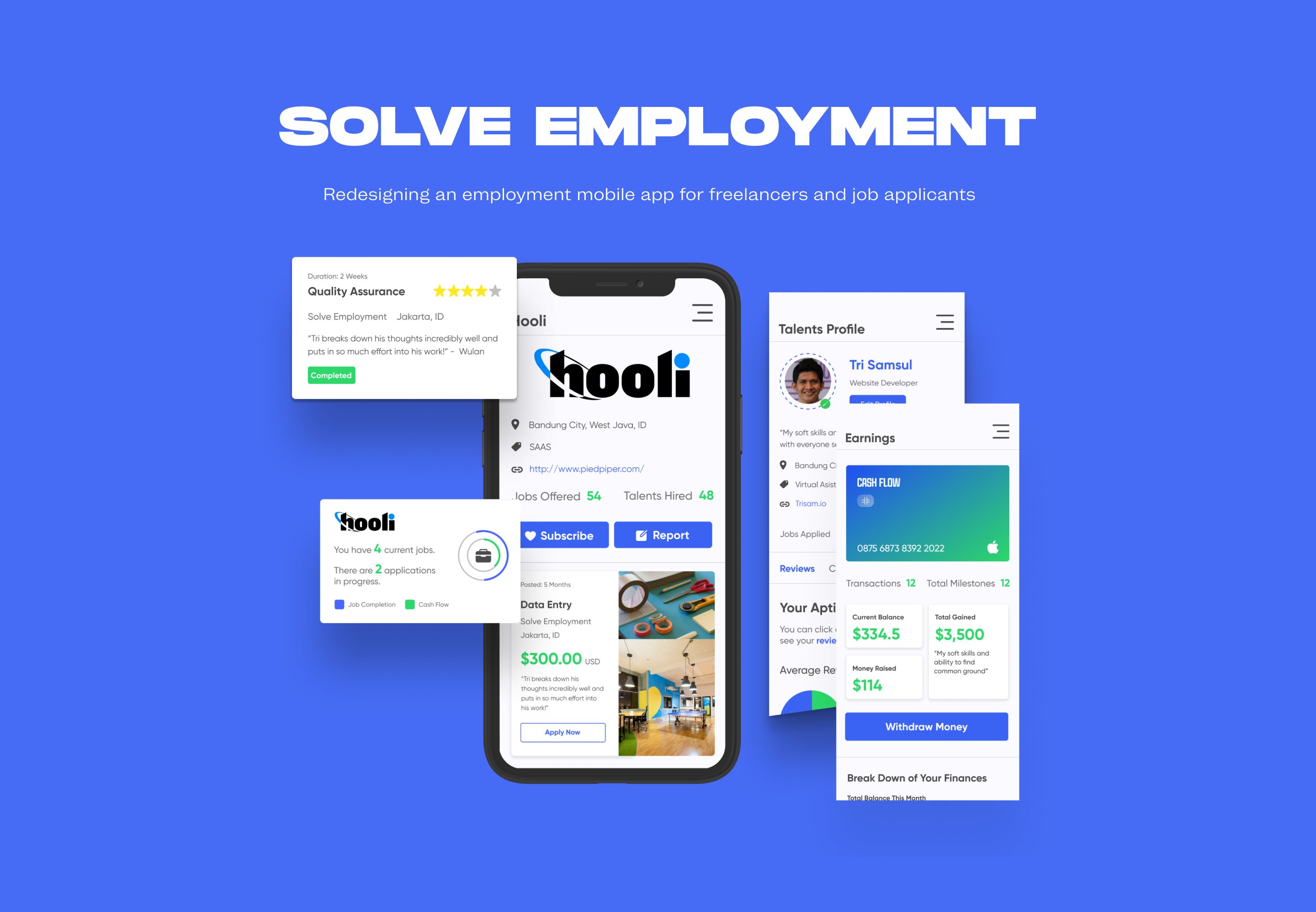
Dashboard/Home
Hamburger Menu
To solve one of our initial problems, our design included a status section at the top of each dashboard to illuminate information such as active jobs or applications. Applicants are now able to view the progress of their active jobs, applications, and disputes as they are submitted, without having to hunt for the information.


Home Page Job Status
(One Stop Shop)
View Job Milestone
Talents Profile


Edit Profile
Earnings
THE UNVEILING: USER TESTING AND FEEDBACK
After reviewing three tests from zoom chats, as well as three user interviews, our team realized there were three major pain points we had to resolve.
1. The “Status” section felt too small and the background was too light.
2. The talent team updated the background color and resized numbers to match the font around it.
3. The Milestone page did not have the ability to check progress or terminate a job in an intuitive way.
The talent team added the ability on “Milestone" to click on the hirer name to visit their company profile and the ability to click the job name to bring it to the page that allows progress updates and termination.


REFLECTIONS AND MAIN TAKEAWAYS
At the end of the two weeks, our team presented our designs the stakeholders. The stakeholders favored the dashboard layout with a menu that talents can tab through to take a quick glance and view applications, work progress, and disputes.
The number of monthly active applicants with a Solve Employment increased by 34%. Below are some main takeaways from this project.
SPEAK UP
During the design process of Solve Employment, I’ve learned to communicate, speak up, and provide feedback when you know your team is not headed in the right direction.
NEVER STOP LEARNING
I learned that just because a stakeholder provides you with company issues and deliverables, doesn’t mean your job is done as a problem solver. There’s still a long road to discovering complex problems as a designer.